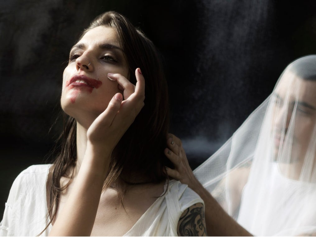
“One or The Other”: Jared Flaming and Eric Helvie Exhibition on view through May 21
“One Or The Other”, on view from May 17 – 21, 2016 at The Highline Loft at 508 West 26th Street, brings together the two artists Jared Flaming and Eric Helvie, in a pairing of photo-realistic works that focus on the ideas of pop culture, media and storytelling in an effort to dig deep into the subconscious mind to find inspiration and artistic creativity. Curated by Anne Huntington and Natalie Kates, both artistsʼ photo-realistic works, juxtaposed by color, black-and-white metaphor and iconography, embrace the psychoanalytical idea of unconscious desires via subliminal images.
In concert with the 4-day show, Huntington and Kates will present a series of experiences to enhance the exhibition, including a Panel discussion with the artists (May 18th) and VAGA hosted opening (May 19th)
Q&A with artist Jared Flaming
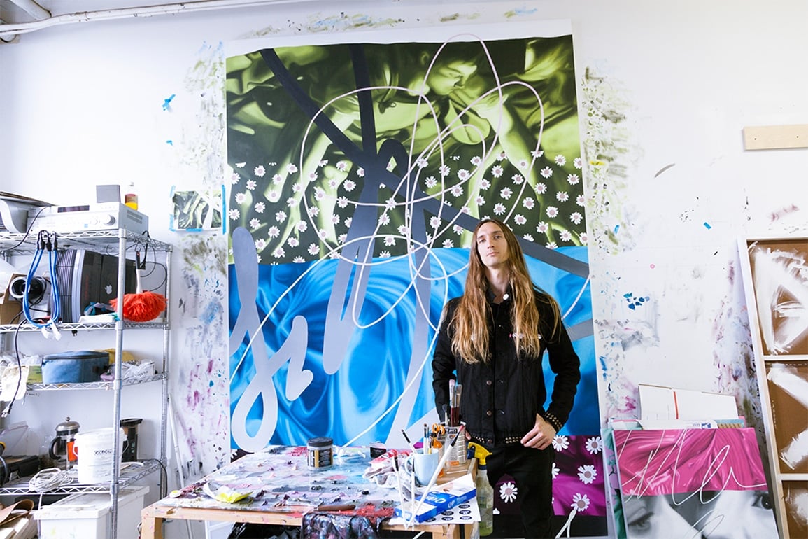
Tell us a bit more about you and your beginnings as an artist.
Well I am a born and raised Oklahoma boy. There wasn’t much art around growing up but there was a lot of craft and I always enjoyed that and spent a lot of time redrawing album covers or painting table top game figures. I went in to the art school in college because it seemed to make the most sense. I started print making because I was really drawn to the methodical process involved. I think it was something about printmaking’s ability to transform images. It is pure mediation. It is methodology that carries through my work still.
How did you come to paint super saturated collages using pop culture photography imagery, mixed with graphic details?
I worked in printmaking through most of my college tenure but after arriving in grad school I had began to become pretty disillusioned with the medium. It started feeling stifling in terms of freedom of mobility in the work. The print world also felt somewhat insular. Print largely talks about print it seemed. I still love that community and I owe a great deal to it but I came to a point where I needed a medium that was more malleable conceptually. I needed a process that allowed me to create work that dealt with issues I was interested in, which was increasingly bound up in notions of representation, meaning, and language. I was reading a lot of post-structuralism and semiology at the time. Painting and photoshop go hand in hand for me. One kind of unlocks the other. The act of recreating digital collages by hand in paint calls the whole image into question.
Is there a specific reason that the figures that you paint are always blurred and out of focus, pushed to the background, juxtaposed with the crisp foreground lines?
I try to deal with figures in my work as I do the other elements, which is to say ass-backwards. I try to deploy elements in a way that naturally compromise them, such as crisp digital scribbles that would take a second to make with the paint brush tool in MS Paint being slowly recreated by hand. The figures often come from western art history, although I veer from that cannon occasionally. The idea is the same though: by mediating a preexisting image through cropping, blurring, duplicating etc. I help release the image from its original context, stripping it of its formal identity and turning it into just another visual element to be reused and recycled in the lexicon of art. Images are just vessels to be filled with meaning and the farther you remove them from their common interpretation the more they are revealed as just empty manifestations.
Does scale play a large part in how you want the viewer to see and react to your work?
Scale plays a large role in how appropriated images can be manipulated. Scale is a form of mediation just like any other. Blowing up or shrinking down images help highlight their status as facsimile. A face that is blown up to almost 6 feet tall is obviously not the original but it maintains a tenuous connection with it.
Unlike many other artists who seem to not title their work, your titles seem significant in viewing your work, even driving the viewer to see certain things. Is this on purpose, and how do you come up with the names of the works?
Actually the titles are all found phrases. I started using this strategy because just going with ‘untitled’ started to feel hackneyed, almost as if it was supposed to be a marker saying ‘this is art.’ I think of Chamberlain’s titles which are mostly found phrases that don’t mean anything in the strict sense, rather they function in an aesthetic manner as the found steal parts do in the work themselves. With mine it was matter of finding a phrase that seemed to relate to something in the work but was too vague to really direct the interpretation of the content. As with a lot of the found images I use it as an attempt to situate elements at a point where their function seemed uncertain. I like to play with the assumptions of how something communicates meaning or content. In terms of the titles, it is a play on how the words associated with a visual work often exert an undue amount of power over it.
Tell us about the works that are being featured May 17th-21st?
The work in this exhibition are all from the most recent body of work produced over the few years. They range from 34″ x 24″ to 102″ x 72″ although my most common size is 68″ x 48″. They all follow a similar conceptual thread but vary visually. I try to use certain tactics such as digital marks or wall paper patterns often, but not consistently so that they function like leitmotifs rather then strictures when viewed as a body of work.
Why did you choose these to show as part of a group show?
Since there are just two artists in this exhibition it isn’t really the same as a group show. In a group show you might only get one example to show of your work and often the work might be chosen based on some sort of over arching theme they are trying to cram the work into. Here both artist are given the opportunity to exhibit 12 or 13 pieces which lets both of us present a cohesive and comprehensive statement of our practice as well as weaving a rather interesting thread between the two bodies of work. I try not to do group shows of more then 4 artists because at that point it just becomes a jumbled mess and most of the nuance is lost in the noise. This is a rather amazing opportunity to not only show next to an artist I deeply respect but also to mount a very thorough series of work for each of us. The work for this show on my end is chosen to complement each other and draw out a line of questioning between them. I hope that each piece raises questions about the others.
Q&A with artist Eric Helvie
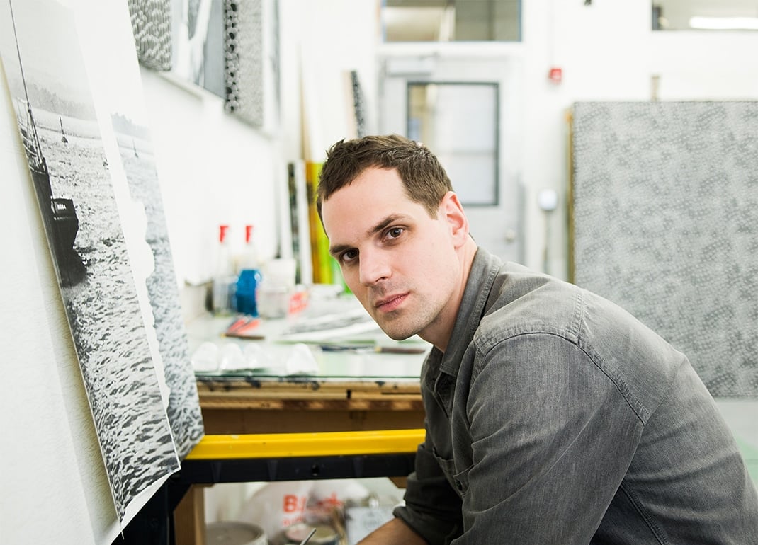
Tell us a bit more about you and your beginnings as an artist.
I was born in Portland, Oregon but moved to South Africa when I was nine. My parents moved there to work with the Zulu and Xhosa tribes doing, among other things, AIDS awareness and counseling. I started getting into art as a way to cope with the ultra strict British prep schools I was sent to as a child. When I was sixteen I started painting and writing very seriously and those two things stuck with me ever since.
Your current work contains a lot of military imagery, camouflage and naval ships.
Yes, to be fair only one of the ships is camouflaged, but I guess you could read into the scales as a kind of camo pattern if you wanted to. The scale pieces are very reminiscent of razzle dazzle or dazzle camouflage, the black and white hard edged patterns they used to paint on ships to create optical confusion in an attempt to camouflage them at sea.
How did you become interested in these vs. what you were doing in the past?
What I was doing in the past was heavily influenced by the painter Francis Bacon and his take on absurdity and violence. It just so happens that Bacon’s favorite film was Battleship Potemkin by Sergei Eisenstein. He watched it over and over and in the end made the painting, “Study for the Nurse from the Battleship Potemkin.” When I found this out, I watched the film and started realizing the potential for battleships as subject matter. I began researching and collecting public domain images of WWI and WWII ships and the rest followed quite naturally.
Have you always worked in a predominantly grey/neutral color scale?
Yes, but not solely. Over the years it’s become more and more important to me to have less and less color. Now I’m at a place where I feel like I might need to let color go completely. My work seems to have been naturally gravitating towards black and white for so long. However, I don’t want to make any dogmatic statements, it’s better if I keep my options open.
What other artists/painters do you like?
I like artists who are able to inject humor, absurdity and violence into their work without undermining the work itself. Philip Guston does this very well, Bacon does it, Franz West, Odilon Redon does it, mostly with his etchings. Goya, Picasso…
Tell us about the works that are being featured May 17th-21st?
It’s a very deliberate pairing of sideways photorealistic battleships and hard edged scale pattern paintings. There is the underlying association with Bacon, but mostly they reference old etchings of sea monsters attacking ships. This is the reason for the incorrect orientation. In most of these old etchings the ship is tilted sharply as the creature pulls it down or unsettles it by churning the water. These are violent images but I wanted to present them differently, colder, filtered through minimalism and formalism. Also, the sideways orientation raises other more political questions, and the fact that each ship is titled, ‘Leviathan,’ just helps this along. I like the idea that the things we used to fear, the creatures of chaos and destruction, have morphed into these metal contraptions of our own making. We have deliberately constructed our own worst fears.
Why did you choose these to show as part of a group show?
I finally had the opportunity to make them; the time was right. And, I figured since Jared’s work is very colorful and mine with complete lack of color would set the work apart and keep things simple. One or the other, you know?
“One Or The Other”, on view from May 17 – 21, 2016 at The Highline Loft at 508 West 26th Street, New York
